Graphs and charts are among the most powerful tools in human communication, transforming raw numbers and complex datasets into visual representations that the human brain can process, interpret, and remember far more effectively than tables of figures or written descriptions. The ability to visualize data — to see patterns, trends, relationships, and anomalies at a glance — is one of the most valuable skills in science, business, journalism, education, and everyday decision-making. A well-chosen, well-constructed chart can communicate in seconds what paragraphs of text and columns of numbers cannot convey in minutes.
The history of data visualization stretches back further than most people realize. William Playfair, a Scottish engineer and political economist, invented the bar chart, line chart, and pie chart in the late 18th century, publishing his groundbreaking work in The Commercial and Political Atlas in 1786. Florence Nightingale used her famous polar area diagrams in 1858 to persuade the British government to improve sanitary conditions in military hospitals — one of the earliest and most consequential uses of data visualization for public health advocacy. John Snow’s dot map of cholera cases in 1854 London is credited with identifying the Broad Street water pump as the source of an outbreak, demonstrating the life-saving potential of geographical data visualization.
The global data visualization market reflects the enormous modern demand for charting and graphing tools. The market was valued at approximately $9 billion in 2023 and is projected to grow at a compound annual growth rate of over 10 percent through 2030, driven by the explosion of data generation, the growth of business intelligence platforms, and the increasing expectation that data-driven insights be communicated visually. Tools such as Tableau, Power BI, D3.js, and Google Charts are used by millions of professionals worldwide to create charts and graphs across every sector of the economy. The following 60 types represent the full breadth of graphical data representation available to communicators and analysts today.
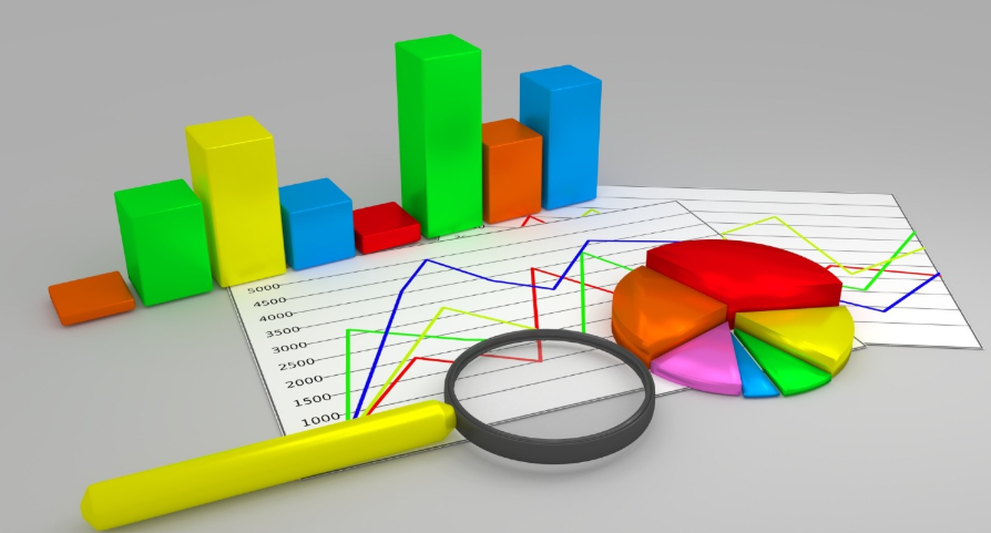
1. Bar Chart
A bar chart displays categorical data using rectangular bars whose lengths are proportional to the values they represent, with bars arranged either vertically (column chart) or horizontally. It is one of the most universally used chart types, ideal for comparing values across discrete categories such as sales by region, population by country, or survey responses by demographic group.
2. Line Chart
A line chart connects individual data points with straight lines to show how a variable changes continuously over time or across a sequence of ordered categories. It is the standard chart for displaying trends, making it the most widely used chart type in financial analysis, scientific research, and economic reporting, where the direction and rate of change over time is the primary insight being communicated.
3. Pie Chart
A pie chart divides a circle into slices proportional to the percentage each category contributes to the whole, providing an immediate visual impression of part-to-whole relationships. Despite being one of the most familiar chart types in everyday communication, pie charts are frequently criticized by data visualization experts for their reliance on area and angle perception — which humans perform less accurately than length perception — making them less precise than bar charts for comparing similar-sized categories.
4. Scatter Plot
A scatter plot displays individual data points as dots positioned according to two variables — one on the horizontal axis and one on the vertical axis — to reveal correlations, clusters, and outliers in bivariate data. It is the foundational chart type for exploratory data analysis, widely used in scientific research, social science, and machine learning to visualize relationships between variables and to identify potential linear or non-linear associations.
5. Histogram
A histogram displays the distribution of a single continuous numerical variable by dividing the data range into consecutive, equal-width intervals called bins and drawing a bar for each bin whose height represents the frequency or count of data points falling within that range. Unlike a bar chart, the bars in a histogram are adjacent with no gaps between them, reflecting the continuous nature of the underlying data. Histograms are essential tools for understanding data distributions, identifying skewness, and detecting outliers.
6. Area Chart
An area chart is essentially a line chart with the area between the line and the horizontal axis filled with color or shading, emphasizing the magnitude of the values rather than just the trend direction. Stacked area charts, in which multiple data series are stacked vertically, are particularly useful for showing how the composition of a total changes over time — such as the changing energy mix of electricity generation or the evolving market share of competing products.
7. Stacked Bar Chart
A stacked bar chart divides each bar into segments representing sub-categories, allowing simultaneous comparison of total values across categories and the composition of each total. The segments are stacked end-to-end within each bar, with each sub-category consistently color-coded across all bars. Stacked bar charts are widely used in business reporting to show both overall performance and its contributing components — such as total revenue broken down by product line across multiple quarters.
8. Grouped Bar Chart
A grouped bar chart places multiple bars side by side for each category, with each bar representing a different data series, allowing direct comparison of multiple variables across the same set of categories. Where a stacked bar chart shows composition, a grouped bar chart facilitates direct comparison of individual sub-category values, making it more appropriate when the absolute values of individual components are as important as the total.
9. Box Plot (Box and Whisker Plot)
A box plot summarizes the statistical distribution of a dataset by displaying the median, interquartile range (the middle 50 percent of the data), and the minimum and maximum values — or a defined range — as a standardized rectangular box with extending “whiskers.” Box plots are invaluable for comparing distributions across multiple groups simultaneously, revealing differences in central tendency, spread, and skewness that summary statistics alone cannot convey.
10. Bubble Chart
A bubble chart extends the scatter plot by adding a third variable encoded as the size of each data point’s circle — the “bubble” — allowing three dimensions of data to be displayed in a two-dimensional space. Hans Rosling’s famous Gapminder visualizations, which animated bubbles to show relationships between life expectancy, income, and population size across countries over time, brought bubble charts to global prominence as a powerful tool for communicating complex, multi-variable datasets to general audiences.
11. Heat Map
A heat map represents data values as colors in a matrix grid, with color intensity indicating the magnitude of each cell’s value — typically using a gradient from cool colors for low values to warm colors for high values, or from light to dark. Heat maps are widely used to visualize patterns in large, complex datasets such as website click patterns, gene expression data, correlation matrices, and geographic density distributions where the spatial or relational structure of the data is as important as the individual values.
12. Treemap
A treemap displays hierarchical data as a set of nested rectangles, with each rectangle’s area proportional to the value it represents and color coding used to add a second dimension of information. Treemaps are particularly effective for showing proportions within a hierarchy — such as the relative size of companies within sectors within an economy, or the storage consumption of files within folders within a file system — where both the overall structure and the relative magnitudes of individual elements are important.
13. Waterfall Chart
A waterfall chart shows how a starting value is incrementally increased and decreased by a series of positive and negative values to arrive at a final total, with each bar starting where the previous one ended and colored to indicate whether it represents an increase or decrease. Waterfall charts are widely used in financial reporting to explain changes in revenue, profit, or cash flow between periods, decomposing an overall change into its contributing components in a visually intuitive format.
14. Funnel Chart
A funnel chart displays data that progressively narrows through sequential stages of a process, with each stage represented as a trapezoid or bar whose width is proportional to the value at that stage. Funnel charts are most commonly used in sales and marketing analytics to visualize conversion rates through a sales pipeline — showing how a large number of initial leads progressively converts to a smaller number of proposals, then opportunities, then closed deals — making drop-off rates at each stage immediately visible.
15. Gantt Chart
A Gantt chart is a horizontal bar chart used in project management to display the schedule of tasks, activities, or phases across a timeline, with each bar representing the duration of a specific task and its position indicating start and end dates. Developed by Henry Gantt in the early 20th century, Gantt charts have become the universal standard for project scheduling and progress tracking, used in construction, software development, event management, and virtually every other field involving coordinated multi-task projects with defined timelines.
16. Radar Chart (Spider Chart)
A radar chart — also called a spider chart or web chart — displays multivariate data on axes radiating from a central point, with each axis representing a different variable and values connected by lines to form a polygon whose shape reflects the overall data profile. Radar charts are popular for comparing the performance profiles of multiple subjects across the same set of dimensions — such as the skill attributes of athletes, the feature comparisons of competing products, or the competency scores of employees across different assessment criteria.
17. Polar Area Chart
A polar area chart — also known as a rose chart or Nightingale chart — divides a circle into equal angular segments like a pie chart but encodes values through the radius of each segment rather than its angle, with all segments having the same angular width but different lengths. Florence Nightingale famously used polar area charts to illustrate causes of mortality in the Crimean War, demonstrating that preventable disease rather than battle wounds was the primary cause of death among British soldiers — a visualization that helped drive major sanitary reforms.
18. Doughnut Chart
A doughnut chart is a variant of the pie chart with the center removed, creating a ring shape that can be used to display multiple concentric rings of related data simultaneously. The hollow center can be used to display a summary statistic — such as the total — and the ring format is generally considered slightly easier to read than a standard pie chart because it reduces reliance on angle estimation. Doughnut charts are widely used in business dashboards and infographics for part-to-whole comparisons.
19. Sankey Diagram
A Sankey diagram uses arrows or flows of varying widths to represent the magnitude of flows between nodes in a network, with the width of each flow proportional to the quantity it represents. Originally developed to visualize energy flows, Sankey diagrams have found wide application in energy analysis, material flow analysis, financial flow visualization, and any context where understanding how quantities flow and transform through a system is important. They are particularly effective at revealing where the largest flows occur and where significant losses or transformations take place.
20. Chord Diagram
A chord diagram displays relationships and flows between entities arranged in a circle, with arcs connecting entities inside the circle whose width represents the magnitude of the relationship or flow between them. Chord diagrams are effective for visualizing complex, many-to-many relationships in a compact, visually engaging format — such as migration flows between countries, trade relationships between economies, or communication patterns between organizational departments.
21. Network Graph
A network graph — also called a node-link diagram — represents entities as nodes (dots or circles) and relationships between them as edges (lines or arrows), revealing the structure and connectivity of complex networks. Network graphs are fundamental tools in social network analysis, biological pathway mapping, computer network visualization, citation analysis, and any domain where understanding the pattern and density of connections between entities is the primary analytical objective.
22. Force-Directed Graph
A force-directed graph is a network graph in which the positions of nodes are determined by a physics simulation — nodes repel each other like charged particles while connected nodes are attracted by spring-like forces — producing a layout that naturally clusters densely connected nodes together and separates loosely connected ones. Force-directed graphs are widely used in interactive data visualization tools because they can reveal community structure and hub nodes in complex networks intuitively without requiring manual layout decisions.
23. Tree Diagram
A tree diagram represents hierarchical relationships as a branching structure, with a root node at the top or center and child nodes branching outward or downward from parent nodes. Tree diagrams are used to visualize organizational hierarchies, file system structures, taxonomic classifications, decision trees in machine learning, family trees, and any other data with a clearly defined parent-child hierarchical structure. The layout can be horizontal, vertical, or radial depending on the depth and breadth of the hierarchy.
24. Sunburst Chart
A sunburst chart is a radial variant of the treemap, displaying hierarchical data as concentric rings divided into segments, with the innermost ring representing the top level of the hierarchy and successive outer rings representing deeper levels. The angular width of each segment is proportional to its value, and segments at deeper levels are subdivisions of their parent segment in the adjacent inner ring. Sunburst charts are effective for visualizing hierarchical data with multiple levels of categorization in a compact, visually engaging format.
25. Pictograph (Pictogram)
A pictograph uses repeated icons or symbols to represent data values, with each symbol representing a defined quantity and the number of symbols being proportional to the value being represented. Pictographs are widely used in infographics, public communications, and educational materials where engaging a general audience is more important than precise quantitative communication, as the use of recognizable symbols makes the data immediately relatable and memorable to viewers without specialist data literacy.
26. Dot Plot
A dot plot displays individual data points as dots along a single axis, providing a simple, uncluttered view of the distribution of a dataset — particularly useful for small to medium datasets where showing individual data points rather than aggregating them into bins preserves important information. Cleveland dot plots, a variant developed by statistician William Cleveland, use dots connected by lines to compare values across categories, and are widely considered a superior alternative to bar charts for precise value comparison because they reduce visual clutter while maintaining accuracy.
27. Strip Plot
A strip plot displays all individual data points as dots arranged along a single categorical axis, showing the complete distribution of values within each category without aggregation. Where a box plot summarizes the distribution statistically, a strip plot reveals every individual observation, making it valuable for small datasets where the individual data points are meaningful. Strip plots are often combined with box plots or violin plots to provide both a statistical summary and a view of the underlying data simultaneously.
28. Violin Plot
A violin plot combines a box plot with a kernel density estimate — a smooth curve showing the probability distribution of the data — to create a shape that widens where data is more densely concentrated and narrows where it is sparse. The resulting shape resembles a violin, with the width at each point along the vertical axis indicating how many data points fall near that value. Violin plots are particularly valuable for comparing distributions across groups when the shape of the distribution — whether it is unimodal, bimodal, or skewed — is important to communicate.
29. Stem and Leaf Plot
A stem and leaf plot organizes numerical data by splitting each value into a “stem” — the leading digit or digits — and a “leaf” — the final digit, displaying stems in a column with leaves listed beside them. It provides a text-based view of data distribution that preserves the original data values while showing their frequency distribution, making it particularly useful in educational settings and for small datasets where a full histogram would be impractical. Unlike a histogram, a stem and leaf plot allows the original data to be recovered from the display.
30. Frequency Polygon
A frequency polygon is created by connecting the midpoints of the tops of histogram bars with straight lines and removing the bars themselves, creating a line-based representation of a frequency distribution. Frequency polygons are particularly useful for comparing two or more distributions on the same chart, as multiple overlapping lines are easier to read than overlapping or side-by-side histograms. They are a common tool in statistics education and in scientific papers where distributional comparisons need to be made efficiently within limited figure space.
31. Ogive (Cumulative Frequency Graph)
An ogive displays the cumulative frequency or cumulative relative frequency of a dataset — showing for each value how many or what proportion of the data falls at or below that value. The resulting S-shaped curve rises from zero to the total count or 100 percent across the data range. Ogives are useful for determining percentiles, comparing distributions, and answering questions about what proportion of data falls within a given range.
32. Pareto Chart
A Pareto chart combines a bar chart showing individual category frequencies in descending order with a line graph showing the cumulative total, visually implementing the Pareto principle — the idea that approximately 80 percent of effects come from 20 percent of causes. Pareto charts are standard tools in quality management and process improvement, used to identify the small number of defect types, customer complaints, or failure modes that account for the majority of problems, helping organizations prioritize their improvement efforts most effectively.
33. Control Chart (Shewhart Chart)
A control chart displays process measurements over time with statistically calculated upper and lower control limits — typically set at three standard deviations from the process mean — to distinguish between normal process variation and statistically significant signals that the process has changed. Developed by Walter Shewhart at Bell Labs in the 1920s and central to statistical process control (SPC) and Six Sigma methodology, control charts are extensively used in manufacturing, healthcare, and service industries to monitor process stability and detect problems before they produce defective outputs.
34. Run Chart
A run chart is a simplified version of the control chart, displaying measurements in time sequence as a line chart with the median shown as a reference line but without the statistical control limits of a formal control chart. Run charts are used in healthcare quality improvement, process monitoring, and any situation where tracking whether a process measurement is trending upward, downward, or remaining stable over time is more important than the formal statistical process control provided by a full control chart.
35. Candlestick Chart
A candlestick chart is the standard chart type for financial market data, displaying the opening price, closing price, high, and low for each trading period as a rectangular “candle” body — filled or hollow depending on whether the price rose or fell — with thin “wicks” extending to the period’s high and low. Originating in 18th century Japanese rice futures trading, candlestick charts have become universally adopted in financial markets worldwide and form the basis of an extensive body of technical analysis patterns used by traders to identify potential price movements.
36. OHLC Chart (Open-High-Low-Close Chart)
An OHLC chart is a financial chart displaying the same four data points as a candlestick chart — open, high, low, and close prices — but using a different visual encoding: a vertical line connecting the high and low, with a small horizontal tick to the left indicating the opening price and a tick to the right indicating the closing price. OHLC charts convey the same information as candlestick charts in a slightly more compact, less colorful format and remain preferred by some technical analysts for their cleaner visual appearance.
37. Kagi Chart
A Kagi chart is a Japanese charting technique used in financial analysis that removes the time dimension entirely, plotting price movements as a series of vertical lines that reverse direction only when the price reverses by a defined minimum amount. The lines alternate between thin (“yin”) and thick (“yang”) depending on whether the most recent reversal was downward or upward, with the line thickness change indicating the reversal of the prevailing trend. Kagi charts filter out minor price fluctuations to reveal underlying trend structure more clearly than time-based charts.
38. Geographic Map Chart (Choropleth Map)
A choropleth map encodes data values for geographic regions — countries, states, counties, or other administrative units — as color intensity, with darker or more saturated colors typically representing higher values. Choropleth maps are widely used in journalism, public health, social science, and political analysis to display geographically distributed data such as election results, disease prevalence, income levels, or population density in an immediately intuitive spatial context that leverages the viewer’s existing geographic knowledge.
39. Dot Density Map
A dot density map places randomly distributed dots within geographic regions, with each dot representing a fixed quantity — such as 1,000 people or 100 cases of a disease — so that the visual density of dots in an area reflects the actual density of the underlying phenomenon. Unlike a choropleth map, which assigns a single value to an entire region regardless of its internal variation, a dot density map reveals the within-region spatial distribution of the data. The 2020 US election maps produced by the New York Times using dot density techniques were widely praised for accurately representing the true geographic distribution of votes.
40. Cartogram
A cartogram distorts the geographic size of regions — replacing accurate geographic area with area proportional to a data variable such as population, GDP, or election votes — creating a map where large wealthy or populous regions appear larger than geographically large but sparsely populated ones. Cartograms are effective at correcting the perceptual bias introduced by conventional maps in which large geographic areas dominate the visual impression regardless of their actual significance on the measured dimension. Electoral cartograms showing countries or states sized by their number of electoral votes have become widely used in election coverage.
41. Flow Map
A flow map uses arrows or lines of varying widths drawn over a geographic base map to represent the movement of people, goods, information, or other quantities between locations, with the width of each flow line proportional to the volume of movement it represents. Flow maps are used to visualize migration patterns, trade flows, transportation networks, communication infrastructure, and any dataset involving movement between geographic points. Charles Joseph Minard’s famous map of Napoleon’s Russian campaign of 1812 — which simultaneously shows troop movements, army size, temperature, and time — is widely considered the greatest statistical graphic ever produced.
42. Timeline Chart
A timeline chart displays events or milestones in chronological order along a horizontal or vertical time axis, providing a visual representation of historical sequences, project schedules, or the development of a phenomenon over time. Unlike a Gantt chart — which focuses on task durations — a timeline chart typically emphasizes discrete events and their temporal relationships, making it a standard tool for historical presentations, product roadmaps, biographical narratives, and any communication where the sequence and timing of events is the central message.
43. Pyramid Chart
A pyramid chart uses a triangular shape divided into horizontal layers to represent hierarchical or proportional data, with the widest layer at the base representing the largest category and progressively narrower layers above representing smaller categories. The most famous application is the population pyramid — two back-to-back horizontal bar charts showing the age and gender distribution of a population — used extensively in demography to visualize and compare population structures across countries and time periods. Maslow’s hierarchy of needs is one of the most widely recognized pyramid chart applications in psychology and management literature.
44. Marimekko Chart (Mosaic Plot)
A Marimekko chart — also called a mosaic plot or mekko chart — is a two-dimensional stacked bar chart in which both the width and height of each bar segment encode data, allowing two variables to be represented simultaneously across a set of categories. The varying widths of the bars represent the relative sizes of the main categories, while the stacked segments within each bar show the composition of each category. Marimekko charts are popular in management consulting and market analysis for visualizing market size and share data simultaneously across multiple market segments.
45. Heatmap Calendar
A heatmap calendar encodes a single variable’s daily values as color intensities displayed in a calendar grid layout — weeks as rows and days of the week as columns, typically spanning a full year. GitHub’s contribution graph, showing daily code commit activity across 52 weeks in a green intensity heatmap calendar, is one of the most widely recognized examples and has made the heatmap calendar format familiar to millions of software developers worldwide. The format is effective for revealing weekly patterns, seasonal trends, and specific high or low activity dates within annual cycles.
46. Bump Chart
A bump chart displays the changing rank of multiple items over time — rather than their absolute values — as a series of lines connecting rank positions across sequential time periods, with crossings of lines indicating rank changes. Bump charts are particularly effective for competition and ranking data such as league standings over a season, country rankings in global indices over years, or product market share rankings over quarters, where the direction and magnitude of rank changes are more meaningful than the underlying absolute values.
47. Slope Chart
A slope chart compares values between exactly two points in time or two conditions for multiple items, displaying each item as a line connecting its value at the first point to its value at the second point. The slope of each line immediately communicates the direction and magnitude of change for each item, making it easy to identify which items increased, decreased, and by how much relative to others. Slope charts are a clean, effective alternative to grouped bar charts for before-and-after comparisons involving multiple items.
48. Dumbbell Chart
A dumbbell chart — also called a dot plot with connecting lines — displays two data points for each category as filled circles (“dumbbells”) connected by a line, immediately communicating the gap or change between the two values for each category. Dumbbell charts are particularly effective for showing the difference between two time points, two conditions, or two groups across multiple categories, combining the precision of dot plots with the visual clarity of the connecting line that makes the magnitude of each gap immediately apparent.
49. Lollipop Chart
A lollipop chart is a minimalist variant of the bar chart that replaces solid bars with a thin line capped by a dot — creating the visual impression of a lollipop — reducing the ink-to-data ratio and visual clutter compared to conventional bars while preserving the comparative clarity of the bar chart. Lollipop charts are particularly effective when comparing many categories where the dense side-by-side bars of a conventional bar chart would create a visually busy, hard-to-read display. The reduction in visual weight makes individual data points easier to read precisely.
50. Diverging Bar Chart
A diverging bar chart displays bars extending in opposite directions from a central baseline — typically zero — to show both positive and negative values, or to compare two groups from a shared reference point. Diverging bar charts are widely used for survey data showing agreement and disagreement (Likert scale data), profit and loss comparisons, temperature anomalies above and below average, and any dataset where both the direction and magnitude of deviation from a reference value are important to communicate simultaneously.
51. Gauge Chart (Speedometer Chart)
A gauge chart displays a single value within a defined range using a needle pointing to a position on a semicircular or circular scale — visually resembling a speedometer or pressure gauge. Gauge charts are popular in business dashboards for displaying key performance indicators against defined target ranges — such as customer satisfaction scores, system performance metrics, or budget utilization — where the visual metaphor of a physical gauge communicates both the current value and its position relative to target zones intuitively.
52. Bullet Chart
A bullet chart was designed by Stephen Few as a more informative, less visually cluttered replacement for gauge charts in dashboard contexts, displaying a primary measure as a solid bar against a background of graduated performance ranges and a reference line indicating a target value. Bullet charts encode three to five variables in a compact horizontal or vertical bar format and allow many metrics to be compared simultaneously in a dashboard without the excessive space consumption of individual gauge charts for each metric.
53. Sparkline
A sparkline is a very small, simple line chart — typically the size of a word — designed to be embedded inline with text or within a table cell to show a trend or pattern alongside the data it describes, without axes, labels, or other chart elements that would require space. Invented by Edward Tufte, sparklines allow high data density communication by placing trend context directly adjacent to numerical values in reports and dashboards. Spreadsheet applications including Microsoft Excel and Google Sheets include built-in sparkline generation capabilities.
54. Venn Diagram
A Venn diagram uses overlapping circles to represent sets and the logical relationships between them — with the overlapping regions showing elements belonging to multiple sets simultaneously and non-overlapping regions showing elements belonging to only one set. Venn diagrams are standard tools in mathematics, logic, set theory, and everyday visual communication for illustrating concepts of intersection, union, and difference between groups. The two-circle Venn diagram is one of the most universally recognized visual formats in education and popular media.
55. Euler Diagram
An Euler diagram is similar to a Venn diagram but does not require circles to overlap when no intersection exists between sets — where a Venn diagram always shows all possible overlapping regions regardless of whether they contain data, an Euler diagram only shows overlapping regions that actually contain elements. This distinction makes Euler diagrams more accurate representations of set relationships in cases where some intersections are genuinely empty, but the terms are frequently used interchangeably in non-technical contexts.
56. Word Cloud (Tag Cloud)
A word cloud displays text data — typically the most frequently occurring words in a corpus — with each word’s size proportional to its frequency, creating a visual impression of the most prominent terms in a dataset. While frequently criticized by data visualization purists for the imprecision of the area encoding — human perception of relative word sizes is inaccurate — word clouds remain enormously popular in marketing, journalism, and social media analysis for their immediate visual impact and their ability to communicate the general character and emphasis of a text body at a glance.
57. Streamgraph
A streamgraph is a variant of the stacked area chart in which the layers flow symmetrically around a central baseline rather than stacking from zero, creating a flowing, organic shape that resembles a river with tributaries. The width of each layer at any point in time represents the value of that category at that time. Streamgraphs are particularly effective for showing the rise and fall of multiple categories over time — such as music genre popularity, box office revenues by film, or disease prevalence over seasons — in a visually engaging format that emphasizes the flowing, dynamic nature of the data.
58. Hexbin Plot
A hexbin plot is a variation of the scatter plot designed for large datasets where overplotting — the overlapping of thousands of individual data points — makes a standard scatter plot unreadable. Instead of individual dots, the plot area is divided into a grid of hexagonal bins, with each hexagon colored according to the number of data points falling within it. The hexagonal shape is used rather than a square grid because hexagons tile space more uniformly and avoid the visual artifacts associated with alignment to axes that square bins can produce.
59. Parallel Coordinates Plot
A parallel coordinates plot displays multivariate data by drawing a separate vertical axis for each variable and representing each data point as a line that crosses all axes at the value of that variable for that observation. The resulting display of many crossing lines reveals clusters, correlations, and outliers in high-dimensional data that cannot be visualized in standard two-dimensional charts. Parallel coordinates plots are widely used in data science, engineering, and multivariate statistics for exploratory analysis of datasets with five or more variables.
60. 3D Surface Plot
A 3D surface plot displays a mathematical function of two variables or a dataset with three continuous variables as a three-dimensional surface rendered in perspective, with height representing the value of the third variable across the two-dimensional plane defined by the other two. Surface plots are widely used in mathematics, physics, engineering, and geography to visualize complex functions, terrain elevation models, response surfaces in experimental design, and any dataset where understanding the three-dimensional shape of a relationship is more informative than any two-dimensional cross-section of it.