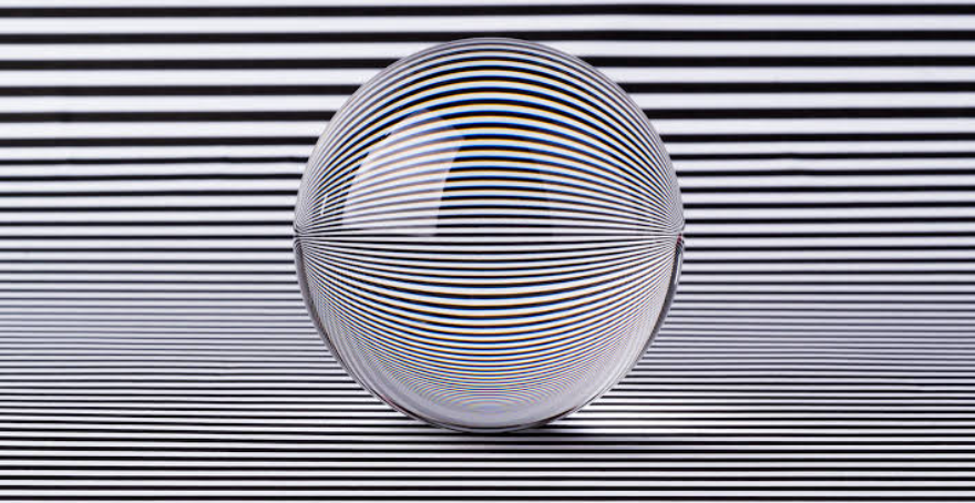
Optical illusions occupy a fascinating space where perception and reality diverge, revealing that what we “see” is never a perfect, unfiltered recording of the world but rather a construction assembled by the brain from incomplete visual information. Every image that reaches the eye is processed through a series of shortcuts, assumptions, and pattern-recognition systems that evolved to help us make fast sense of our surroundings, and optical illusions are simply situations where those shortcuts lead the brain to a conclusion that doesn’t match physical reality. Far from being a flaw or a trick, this gap between perception and reality is a natural byproduct of a visual system built for speed and efficiency rather than perfect accuracy, and studying it has become one of the richest avenues for understanding how vision and cognition actually work.
Optical illusions are typically grouped into a few broad categories based on the mechanism behind them. Literal illusions create an image that differs from the objects that compose it, as when a collection of unrelated shapes combines to form a recognizable picture. Physiological illusions arise from the eyes or brain being overstimulated by a particular quality of an image, such as brightness, color, movement, or repeating patterns, leading to visual effects like afterimages or apparent motion in a static picture. Cognitive illusions, the largest and most studied category, occur when the brain’s unconscious inferences about depth, size, context, or perspective are applied to a situation where those assumptions don’t actually hold, producing effects like objects that appear to change size, lines that appear to bend, or shapes that seem to shift depending on how they’re viewed.
Beyond their entertainment value, optical illusions have long served as valuable research tools in neuroscience and psychology, since they offer a controlled way to study exactly how and where perception breaks down. Researchers use illusions to map out which parts of the visual processing pathway are responsible for interpreting depth, motion, color, and form, and many well-known illusions have directly informed theories about how the brain constructs a stable, three-dimensional sense of the world from two flat images on the retina. The sixty illusions described below represent a broad cross-section of this field, spanning geometric distortions, ambiguous figures, motion effects, color and brightness tricks, and impossible objects, each illustrating a different quirk in the way the human visual system makes sense of what it sees.
Optical Illusions
Müller-Lyer Illusion
The Müller-Lyer illusion consists of two lines of equal length, each capped with arrow-like fins pointing either inward or outward. The line with outward-pointing fins consistently appears longer than the one with inward-pointing fins, even though both lines are identical in length. Researchers believe the effect stems from the brain’s tendency to interpret the fins as depth cues resembling the corners of a room, triggering size-constancy adjustments that don’t apply to a flat image.
Ponzo Illusion
The Ponzo illusion places two identical horizontal lines across a pair of converging diagonal lines that resemble railway tracks receding into the distance. The line positioned higher up, closer to the point of convergence, appears longer than the lower line, even though both are the same length. This happens because the brain interprets the converging lines as a perspective cue and assumes the “farther” line must be larger to appear the same size at a greater distance.
Ebbinghaus Illusion
In the Ebbinghaus illusion, a central circle surrounded by a ring of large circles appears smaller than an identical central circle surrounded by a ring of small circles. The effect demonstrates how the brain judges size relative to context rather than in absolute terms, comparing the central shape against its immediate surroundings. This illusion has been widely used in psychology to study how perception can diverge from the motor actions used to interact with an object.
Hermann Grid Illusion
The Hermann grid illusion appears as a grid of black squares separated by white lines, with faint gray smudges seeming to flicker at the intersections when viewed peripherally. The smudges disappear when looked at directly, a quirk attributed to how retinal neurons respond differently to light at the center versus the edges of their receptive fields. It’s considered a physiological illusion since it arises from lower-level visual processing rather than higher cognitive interpretation.
Kanizsa Triangle
The Kanizsa triangle uses three partial circles, each with a wedge cut out, arranged so that the human brain perceives a bright white triangle overlapping them, even though no triangle is actually drawn. This is a classic example of illusory contours, where the visual system fills in edges and shapes that aren’t physically present based on surrounding cues. It has been influential in studies of how the brain completes incomplete visual information.
Rubin’s Vase
Rubin’s vase is an ambiguous figure that can be seen either as a white vase centered on a black background or as two black silhouetted faces looking at each other. The image demonstrates figure-ground perception, the brain’s process of distinguishing an object from its background, and shows how the same visual input can support two entirely different interpretations depending on which region is perceived as the “figure.”
Necker Cube
The Necker Cube is a simple wireframe drawing of a cube that appears to spontaneously flip orientation as it’s viewed, with either the front or back face seeming to project toward the viewer. Because the drawing provides no depth cues like shading or occlusion, the brain cannot settle on a single three-dimensional interpretation and alternates between two equally valid readings. It remains one of the most widely used examples of bistable perception in vision science.
Penrose Triangle
The Penrose triangle depicts a triangular structure that appears to be a solid three-dimensional object made of three straight beams connected at right angles, a shape that cannot actually exist in three-dimensional space. Each corner of the drawing is locally consistent and appears plausible, but the object as a whole violates the rules of Euclidean geometry when interpreted as a whole. The illusion relies on the brain’s tendency to interpret two-dimensional line drawings as three-dimensional objects using local depth cues.
Penrose Stairs
The Penrose stairs, also known as the impossible staircase, show a staircase that appears to loop continuously upward or downward without ever gaining or losing height. Like the Penrose triangle, the illusion works because each individual segment of the staircase looks structurally sound, but the overall configuration is geometrically impossible. It was famously used by artist M.C. Escher in his lithograph “Ascending and Descending.”
Café Wall Illusion
The café wall illusion features rows of alternating black and white tiles offset slightly from row to row, separated by thin gray grout lines, which causes the horizontal lines to appear as though they are tilted or wedge-shaped rather than perfectly straight and parallel. The distortion is thought to arise from how neurons in the visual cortex respond to the contrast and offset pattern between the tiles and grout lines. It was first documented on the tiled wall of a café in Bristol, England, which gave the illusion its name.
Zöllner Illusion
The Zöllner illusion consists of a series of long parallel diagonal lines, each crossed by short, shorter perpendicular hatch marks angled slightly off from a right angle. Despite being perfectly parallel, the long lines appear to tilt in alternating directions due to the influence of the angled hatch marks on the brain’s perception of orientation. It is often grouped with other “tilt illusions” that reveal how surrounding context can distort perceived line angles.
Ames Room
The Ames room is a distorted, trapezoidal room built to appear rectangular when viewed from one specific vantage point, causing two people standing in different corners to appear dramatically different in size, even though they are roughly the same height. The illusion works because the brain assumes the room is a normal rectangular shape and adjusts its estimate of a person’s size based on that false assumption. It has been used in film and photography to create dramatic size discrepancies between actors.
Moon Illusion
The moon illusion refers to the common perception that the moon looks significantly larger when it is near the horizon compared to when it is high in the sky, even though its actual size and distance from Earth remain essentially constant. Several theories have been proposed to explain the effect, including the idea that the brain judges the horizon moon against distant terrestrial objects like trees and buildings, exaggerating its apparent size by comparison. Photographs consistently show the moon is the same physical size in both positions, confirming the effect is purely perceptual.
Checker Shadow Illusion
The checker shadow illusion, created by vision scientist Edward Adelson, shows a checkerboard pattern with a cylinder casting a shadow across part of it, in which two squares that are printed in the exact same shade of gray appear to be different shades, one seemingly light and one seemingly dark. The brain compensates for the shadow by assuming the square within it must be lighter than it appears in order to account for reduced illumination, a process known as lightness constancy. When the surrounding context is removed, the two squares are revealed to be identical.
Troxler’s Fading
Troxler’s fading occurs when a person fixates on a central point in an image while a faint or blurred pattern surrounding it gradually seems to fade from view or disappear entirely. This happens because the visual system reduces its response to unchanging, static stimuli in the peripheral visual field, a form of neural adaptation. The effect was first described by Swiss physician Ignaz Troxler in the early 19th century.
Motion Aftereffect (Waterfall Illusion)
The motion aftereffect, often called the waterfall illusion, occurs after staring at a continuously moving pattern, such as flowing water, for an extended period and then shifting one’s gaze to a stationary object, which then appears to drift in the opposite direction. The effect is caused by the temporary fatigue of motion-detecting neurons that were tuned to the original direction of movement. It remains one of the most studied examples of sensory adaptation in the visual system.
Autokinetic Effect
The autokinetic effect describes the perception that a small, stationary point of light in an otherwise completely dark environment appears to move erratically, even though it remains fixed in place. Because the brain lacks reference points to judge the light’s position accurately in total darkness, small involuntary eye movements are misattributed to movement of the light itself. The effect has historically been used in psychology to study group conformity and suggestibility, since people’s estimates of the light’s “movement” can be influenced by others’ reports.
Spinning Dancer Illusion
The spinning dancer illusion is a silhouette of a rotating dancer that appears to some viewers to be spinning clockwise and to others counterclockwise, with many people able to consciously “flip” the perceived direction after some effort. Because the image is a flat silhouette with no explicit depth cues, the brain must infer the direction of rotation, and different viewers’ visual systems settle on different, equally valid interpretations. It became widely popular online as an internet meme in the mid-2000s.
Barberpole Illusion
The barberpole illusion refers to the effect seen on a traditional rotating barber’s pole, in which diagonal stripes appear to move upward continuously even though the pole itself is only rotating around its vertical axis, not translating in any direction. This occurs because the visual system, viewing the stripes through a narrow rectangular window, cannot determine the true direction of motion and defaults to the direction of the stripes’ orientation. It’s a classic demonstration of what’s known as the aperture problem in motion perception.
Herman von Helmholtz’s Checkerboard (Simultaneous Contrast)
Simultaneous contrast illusions, closely associated with early vision researcher Hermann von Helmholtz, involve identical colors or shades of gray appearing different depending on the colors or shades surrounding them. A mid-gray square placed on a black background looks lighter than the same gray square placed on a white background, despite being physically identical in both cases. The effect illustrates that color and brightness perception is always relative to context rather than absolute.
Chubb Illusion
The Chubb illusion demonstrates that the perceived contrast of a textured patch depends heavily on the texture surrounding it, with a low-contrast patch appearing to have much higher contrast when surrounded by an even lower-contrast background. This effect is distinct from simple brightness illusions because it involves the perceived difference between light and dark regions within a pattern, rather than the perceived brightness of a solid shape. It has been used to study how the visual system normalizes contrast across a scene.
White’s Illusion
White’s illusion features gray bars placed across a series of alternating black and white stripes, where identical gray bars appear lighter or darker depending on whether they sit on the black or white stripes, but in a way that runs counter to what simple simultaneous contrast would predict. This unusual behavior has made White’s illusion particularly important in vision science, since it challenges simpler models of brightness perception and has pushed researchers toward more complex theories of how context shapes lightness judgments.
Poggendorff Illusion
The Poggendorff illusion presents a single straight diagonal line passing behind a rectangular block, with the line appearing to be offset or misaligned on either side of the block even though it is, in fact, perfectly continuous. The effect is thought to arise from the brain’s difficulty accurately extrapolating the angle of a partially occluded diagonal line. It remains one of the most robust and well-studied of the classic geometric illusions.
Delboeuf Illusion
The Delboeuf illusion involves two circles of identical size, one surrounded closely by a slightly larger ring and the other surrounded by a much larger ring, causing the first circle to appear larger than the second. Similar in principle to the Ebbinghaus illusion, it demonstrates how the perceived size of an object is influenced by the size of its immediate surrounding context. It has also been referenced in studies of portion perception, since it may partly explain why food looks different in size depending on plate size.
Jastrow Illusion
The Jastrow illusion consists of two identical curved shapes, resembling banana slices or crescent forms, arranged one above the other, with the lower shape typically appearing larger than the upper one. The effect is attributed to the way the curved edges align differently depending on their position relative to each other, distorting the brain’s size comparison. It’s often used as a simple, accessible demonstration of context-dependent size perception in introductory psychology courses.
Shepard Tables Illusion
The Shepard tables illusion, created by cognitive scientist Roger Shepard, presents two parallelogram-shaped tabletops that appear to have dramatically different length-to-width proportions, one looking long and narrow and the other short and wide, even though the two shapes are identical in size and only differ in orientation. The effect demonstrates how strongly the brain’s assumptions about three-dimensional perspective distort judgments of flat, two-dimensional shapes. It remains one of the most striking illustrations of the power of perceived depth over actual measurement.
Fraser Spiral Illusion
The Fraser spiral illusion appears to show a continuous spiral winding inward, but the image is actually composed of a series of separate concentric circles overlaid with angled line segments that create the illusion of a spiral. The angled segments trick the brain’s edge-detection system into perceiving a continuous diagonal path rather than a set of closed loops. Tracing the “spiral” with a finger reveals that it actually loops back to its starting point rather than continuing inward.
Impossible Trident (Blivet)
The impossible trident, also called a blivet or devil’s fork, is a two-dimensional drawing that appears to represent a three-pronged fork at one end and a solid rectangular bar at the other, a combination that cannot exist as a coherent three-dimensional object. The illusion works by exploiting the brain’s habit of interpreting different parts of an image locally and consistently, without checking whether those local interpretations are globally compatible. It has appeared frequently in popular culture as a symbol of visual paradox.
Escher’s Waterfall
M.C. Escher’s lithograph “Waterfall” depicts a water channel that appears to flow downhill through a zigzagging aqueduct before pouring over a waterfall, only to somehow arrive back at its own starting point at the top, forming an impossible perpetual motion loop. The piece relies on the same principles as the Penrose triangle, since each individual segment of the structure looks structurally plausible in isolation. Escher was known for repeatedly exploring impossible geometry throughout his body of work.
Escher’s Relativity
Escher’s lithograph “Relativity” depicts a complex architectural structure with multiple staircases, doorways, and walkways, each oriented according to a different, internally consistent direction of gravity, so that figures walking through the scene appear to defy physics relative to one another. The piece demonstrates how convincingly the brain can be led to accept multiple, mutually contradictory spatial systems within a single image. It remains one of Escher’s most widely reproduced and referenced works in discussions of impossible perspective.
Impossible Elephant
The impossible elephant illustration depicts an elephant whose legs are drawn in a way that makes it ambiguous how many legs the animal actually has, since the outlines of the legs overlap and merge in a manner that defies a single, consistent count. Viewers often find themselves recounting the legs repeatedly, unable to settle on a definitive number. The illusion relies on ambiguous contour lines that can be grouped into more than one coherent interpretation.
Rabbit-Duck Illusion
The rabbit-duck illusion is a simple line drawing that can be interpreted either as a rabbit facing one direction or a duck facing the opposite direction, depending on which features the viewer’s brain groups together as the “front” of the animal. It is one of the oldest documented ambiguous figures, dating back to at least the late 19th century, and has been used extensively in philosophy and psychology to discuss the nature of perception and interpretation. The image can typically be made to flip between the two readings with a small amount of mental effort.
Old Woman/Young Woman Illusion
The old woman/young woman illusion, sometimes called “My Wife and My Mother-in-Law,” depicts a single image that can be seen either as an elderly woman with a large nose and chin, or as a young woman looking away with a small nose and a necklace at her throat. Like the rabbit-duck figure, it demonstrates bistable perception, where the same visual information supports two mutually exclusive interpretations. The illusion became widely known after being popularized in a 1915 cartoon.
Boring Figure
The Boring figure is another name for the old woman/young woman illusion, referencing psychologist Edwin Boring, who used the image extensively in his research and writing on ambiguous perception during the early 20th century. Boring’s work helped establish the image as a standard teaching tool in psychology courses covering perception and cognitive interpretation. The figure continues to be referenced in modern discussions of how prior expectations shape what we perceive.
Face-Vase Illusion Variants
Beyond the classic Rubin’s vase, numerous variant illusions use the same figure-ground principle with different silhouettes, such as two profile faces forming a chalice, a candlestick, or other symmetrical objects between them. These variants are frequently used in design and branding, most famously in a well-known logo that hides two profile faces facing each other within its negative space. The underlying mechanism remains the same: the brain must decide which region of the image constitutes the “figure” and which is merely background.
Impossible Waterfall Staircase Loop Illusion
This category of illusion, closely related to Escher’s work, involves combining looping staircases and flowing water into a single scene where the water appears to flow uphill or in an endless loop without ever violating gravity within any single local section of the structure. These illustrations require careful manipulation of perspective lines so that each individual segment remains locally believable, even though the composite structure is globally impossible. Digital artists frequently recreate and modernize these effects using 3D rendering software.
Scintillating Grid Illusion
The scintillating grid illusion is a variation of the Hermann grid in which gray dots are placed at the intersections of a grid of dark lines on a light background, causing the dots to appear to flicker rapidly between black and white as the eyes move across the image. The effect is considerably stronger than the standard Hermann grid illusion and is thought to result from similar retinal and early visual cortex processing mechanisms. It remains a popular illusion for demonstrating how quickly perception can be disrupted by relatively simple repeating patterns.
Hering Illusion
The Hering illusion consists of two straight, parallel vertical lines overlaid on a radiating pattern of lines converging toward a central point, causing the parallel lines to appear as though they are bowing outward at the middle. The radiating background lines create a false sense of depth and perspective that distorts the perceived shape of the straight lines. It was first described by physiologist Ewald Hering in the 19th century and remains a foundational example in the study of geometric illusions.
Wundt Illusion
The Wundt illusion is closely related to the Hering illusion but inverts the effect, using converging background lines that cause two straight, parallel vertical lines to appear as though they are curving inward toward each other at the top and bottom. Named after psychologist Wilhelm Wundt, it demonstrates the same underlying principle as the Hering illusion, showing how radiating context lines can distort the perceived curvature of otherwise perfectly straight lines.
Orbison Illusion
The Orbison illusion places a perfect square or circle over a background of radiating lines converging toward a single point, causing the square’s sides to appear bowed or the circle’s outline to appear distorted, even though the shape itself is entirely undistorted. Like the Hering and Wundt illusions, the effect stems from the brain misapplying depth and perspective cues from the background pattern onto the overlaid shape. It has been used to study how strongly background context can override the perception of a well-defined geometric outline.
Shepard’s Illusion of Tabletop Length
Related to the Shepard tables illusion, this specific effect focuses on how a single rectangular shape, when drawn with converging edges to suggest three-dimensional depth, appears to have significantly different proportions depending on its orientation on the page. Viewers consistently misjudge one orientation as noticeably longer or narrower than the other, despite the two being identical when measured directly. It underscores just how automatically and involuntarily the brain applies perspective corrections to two-dimensional line drawings.
Impossible Cube (Escher’s Belvedere Cube)
The impossible cube, prominently featured in Escher’s lithograph “Belvedere,” depicts a cube-like structure in which the front and back faces are connected in a way that violates consistent three-dimensional geometry, with certain edges appearing to pass both in front of and behind other edges simultaneously. As with other Escher-style impossible objects, each corner of the drawing looks individually plausible, but the structure as a whole cannot be built in physical space. It remains a popular subject for both hand-drawn illustrations and 3D-printed novelty sculptures that recreate the illusion from a specific viewing angle.
Impossible Barn (Ternus Illusion Variant)
Certain impossible-object illustrations depict barns, houses, or other structures whose rooflines and support beams connect in geometrically contradictory ways, similar in spirit to the impossible trident but applied to architectural forms. These images rely on carefully controlled perspective lines that make each wall or beam section locally consistent while creating global contradictions. They are frequently used in illusion compilation books and puzzle collections as variations on the classic impossible object theme.
Adelson’s Snake Illusion
Adelson’s snake illusion, created by the same researcher behind the checker shadow illusion, presents a coiled snake pattern made of alternating light and dark segments, some of which are physically identical in shade but appear markedly different due to shadow-like gradients painted across the image. The effect demonstrates lightness constancy in a dynamic, curved context rather than the flat checkerboard used in Adelson’s earlier illusion. It has become a popular teaching tool for illustrating how strongly context influences the perception of brightness.
Color Assimilation (Watercolor Illusion)
The watercolor illusion occurs when a shape is outlined with two parallel lines, one darker and one lighter, causing the enclosed area to appear tinted with a faint wash of the lighter line’s color, even though the interior of the shape is left completely uncolored. This differs from simultaneous contrast, which tends to push perceived colors apart, since the watercolor effect actually spreads or “assimilates” color inward from the border. It has been studied extensively for what it reveals about how the visual system fills in color across large uniform regions.
Bezold Effect
The Bezold effect describes how the overall color impression of a pattern can change dramatically depending on the color used for a single element within it, such as thin lines or a background hue interacting with a repeated shape. First described by German professor Wilhelm von Bezold in the context of textile and carpet design, the effect shows how substituting one color in a pattern can make the whole design appear lighter, darker, or shifted in hue overall. It remains relevant today in graphic design and printmaking.
Impossible Motion (Kokichi Sugihara’s Illusions)
Japanese researcher Kokichi Sugihara has created a series of physical wooden and 3D-printed sculptures that, from one specific viewing angle, appear to defy gravity, showing balls seeming to roll uphill or structures that seem to contradict basic physical laws. These sculptures use carefully calculated distortions in their actual three-dimensional shape that only resolve into a convincing illusion from a single precise vantage point. Sugihara’s work has won multiple awards in illusion design competitions and blends traditional impossible-object principles with real, physically built objects.
Peripheral Drift Illusion
The peripheral drift illusion uses a repeating pattern of asymmetric, sawtooth-like shading, typically in high contrast colors, that appears to create continuous motion or rotation when viewed with shifting eye movements, even though the image itself is entirely static. The effect is strongest in peripheral vision and tends to diminish or stop when the pattern is stared at directly. It is believed to result from small timing differences in how the visual system processes different levels of luminance contrast.
Rotating Snakes Illusion
The rotating snakes illusion, created by vision scientist Akiyoshi Kitaoka, is one of the most famous examples of the peripheral drift effect, using a pattern of circular “snake” shapes made of repeating light and dark segments that appear to rotate continuously when the eyes move across the image. Despite being a completely static picture, many viewers report a strong and persistent sense of motion. It became especially popular online due to its striking, almost unsettling visual effect.
Impossible Trident Fork Illusion (Variant Forms)
Beyond the classic blivet, artists have created many variant “impossible fork” style illustrations that combine different numbers of prongs, textures, or shading styles while relying on the same fundamental trick of locally consistent but globally contradictory line work. These variants are often used in illusion puzzle books to introduce the concept of impossible figures before moving on to more complex Escher-style compositions. Each variant demonstrates the same underlying principle, that the brain interprets small regions of an image before checking whether those interpretations fit together as a whole.
Thatcher Effect
The Thatcher effect, named after a famous manipulated photograph of Margaret Thatcher, describes how flipping the eyes and mouth of an upside-down face while leaving the rest of the face inverted produces an image that looks only mildly odd when viewed upside down, but grotesquely disturbing when the whole image is turned right-side up. This happens because face perception relies heavily on holistic processing that is disrupted by inversion, making it harder to notice localized distortions in an upside-down face. The effect is considered strong evidence that human face recognition works differently from the way we process other categories of objects.
Composite Face Illusion
The composite face illusion occurs when the top half of one person’s face is aligned directly with the bottom half of a different person’s face, causing the two halves to be perceived as blending into a single, unified new face, even when viewers know the two halves belong to different individuals. This effect disappears when the two halves are offset or separated by a visible gap, restoring the ability to recognize each half independently. It has become an important tool in cognitive research on how the brain processes faces holistically rather than as a collection of separate features.
McGurk Effect
Although primarily an auditory-visual illusion rather than a purely visual one, the McGurk effect demonstrates how strongly visual information can override auditory perception, as when a video showing a person mouthing one syllable is dubbed with an audio recording of a different syllable, causing viewers to perceive an entirely third sound that blends the visual and auditory cues. The effect only occurs when both the visual and audio components are presented together, disappearing if the viewer closes their eyes. It’s frequently cited as evidence that the brain integrates information across multiple senses rather than processing each one in total isolation.
Impossible Waterfall Painting (Shigeo Fukuda’s Illusions)
Japanese artist Shigeo Fukuda created a range of sculptural and shadow-based illusions, including pieces where a jumbled arrangement of everyday objects casts a coherent, recognizable shadow, such as a group of scattered utensils projecting the shadow of a motorcycle. These works rely on precise physical arrangement calculated from a single light source and viewing angle, blending sculpture with two-dimensional illusion. Fukuda’s work is frequently referenced in discussions of how illusions can be built into physical, three-dimensional installations rather than flat images.
Anamorphic Illusion
Anamorphic illusions use deliberately stretched or distorted images that only resolve into a recognizable, undistorted picture when viewed from a specific angle or through a specialized mirror, such as a cylindrical or conical reflective surface. Street artists frequently use large-scale anamorphic chalk drawings on pavement that appear to show three-dimensional objects, such as canyons or holes, only from one particular vantage point. The technique dates back centuries, with early anamorphic paintings used to hide political or religious imagery from casual viewers.
Vasarely’s Op Art Patterns
Hungarian-French artist Victor Vasarely was a pioneer of Op Art, a movement built around geometric patterns designed to create strong illusions of movement, depth, and vibration purely through the arrangement of color, shape, and contrast. His works often used repeating grids of circles or squares that appear to bulge, warp, or pulse outward from a flat canvas. Vasarely’s paintings remain some of the most widely reproduced examples of how abstract geometric design alone, without any narrative content, can produce powerful perceptual effects.
Bridget Riley’s Op Art Illusions
British artist Bridget Riley is known for large-scale black-and-white and later colorful paintings composed of precisely arranged wavy lines or repeating shapes that create an overwhelming sense of movement, shimmering, or rippling across the canvas. Riley’s work demonstrates how carefully controlled variations in line spacing and curvature can trigger involuntary visual effects, sometimes described by viewers as almost physically uncomfortable to look at for extended periods. Her paintings remain central reference points in any discussion of Op Art and physiological visual effects.
Impossible Waterwheel Illusion
The impossible waterwheel illusion depicts a wheel or gear-like structure in which the spokes or blades appear to connect in contradictory ways, similar in spirit to Escher’s impossible staircases and waterfalls but applied to a rotating mechanical form. These illustrations rely on carefully calculated perspective lines that make each spoke look plausible individually while creating an impossible structure overall. They are often used as advanced examples in illusion-focused art and puzzle books, building on the simpler principles introduced by the Penrose triangle and stairs.
Shepard’s Elephant Illusion
Roger Shepard also created a well-known illusion involving elephant legs, similar in effect to the impossible elephant illustration, in which overlapping outlines make it genuinely difficult to determine how many legs the animal has. Shepard used illusions like this extensively in his broader research into mental rotation and spatial reasoning, seeking to understand how the brain manipulates and interprets visual information. His work bridged the gap between purely artistic illusions and rigorous experimental psychology.
Impossible Ring Illusion
The impossible ring illusion depicts a circular or ring-shaped object whose cross-section appears to twist or interlock with itself in a way that could not exist as a continuous physical structure, often resembling a variation on the Möbius strip concept applied to a solid ring. Like other impossible object illustrations, the trick relies on locally consistent shading and perspective that break down when the object is considered as a whole. These designs frequently appear in jewelry and sculpture as novelty pieces that recreate the illusion from a fixed viewing angle.
Munker-White Illusion
The Munker-White illusion, a color variant of White’s illusion, shows identical colored bars or stripes appearing to shift dramatically in perceived hue depending on the color of the thin stripes overlaid across them. This illusion is notable for producing color shifts that are considerably stronger than those seen in traditional simultaneous contrast effects, and it has proven difficult to fully explain with existing models of color perception. It remains an active area of research in color vision science.
Impossible Möbius Strip Variants
While the standard Möbius strip is a real, physically constructable object with only one continuous surface and edge, several illusion artists have created two-dimensional drawings of Möbius-like structures that exaggerate or falsify the twist in ways that could not be built as a single continuous surface. These illustrations play on the public’s general familiarity with the real Möbius strip to make the impossible variant feel more plausible than it actually is. They are often used in illusion art to blend a well-known mathematical object with fully impossible geometry.
Autostereogram (Magic Eye Illusion)
Autostereograms, popularly known as Magic Eye images, are two-dimensional patterns that contain a hidden three-dimensional image visible only when the viewer’s eyes are deliberately defocused or crossed in a specific way, allowing the brain to fuse two slightly offset repeating patterns into a single depth-based image. The technique relies on binocular disparity, the same underlying mechanism that allows normal stereoscopic vision to perceive depth from two slightly different eye viewpoints. These images became widely popular in books and posters during the 1990s and remain a staple of illusion-based entertainment.
Impossible Fork Sculpture (3D Blivet Sculptures)
Physical sculptures based on the impossible trident or blivet design have been built that appear, from one specific vantage point, to be the classic two-pronged-to-three-pronged impossible object, even though the sculpture is a real, physically consistent three-dimensional shape when viewed from other angles. These sculptures use a similar principle to Sugihara’s impossible motion pieces, relying on carefully calculated real geometry that only resolves into the illusion from a single fixed viewpoint. They are frequently displayed in science museums and illusion exhibitions as tangible proof of how convincingly two-dimensional tricks can be extended into three-dimensional space.